


An eyeshadow palette is more than just a collection of colours; it's a curated story waiting to be told on your eyelids. At first glance, the array of shades can seem daunting, but understanding the logic behind their arrangement is the key to unlocking endless creative possibilities. Whether you're aiming for a subtle daytime enhancement or a dramatic evening look, learning to read your palette is the first step towards mastering the art of eye makeup and expressing your personal style with confidence.
Decoding the Palette's Map
Most eyeshadow palettes are designed with a specific logic or 'colour story' in mind, making it easier for the user to create cohesive looks. The arrangement is rarely random. By paying attention to the layout, you can quickly decipher the intended combinations.
Arrangement by Rows, Columns, or Quads
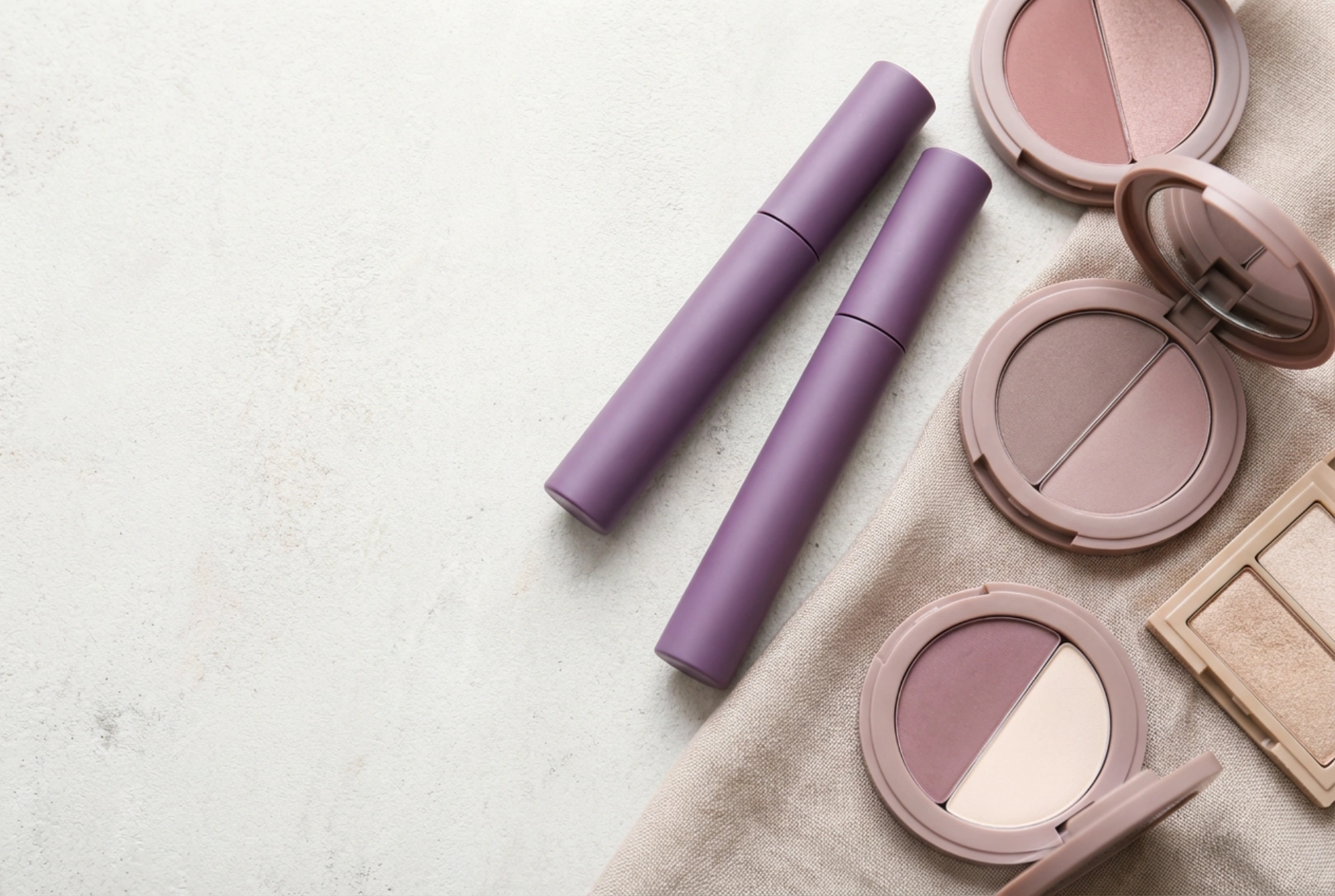
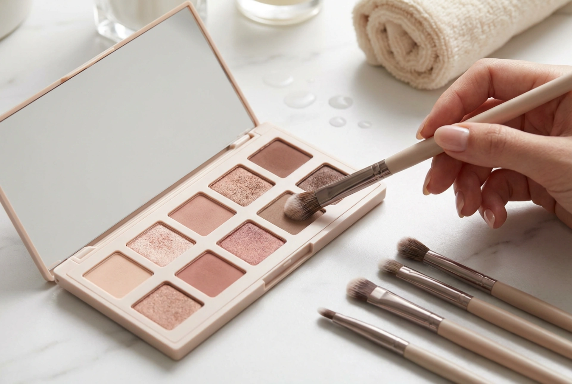
Many larger palettes organise shades in horizontal rows, where each row contains all the colours needed for one complete eye look (e.g., a lid shade, a crease shade, and a highlighter). Others arrange them in vertical columns, often progressing from the lightest shade at the top to the darkest at the bottom, creating a simple gradient effect. Smaller palettes, such as quads (four colours) or quints (five colours), are typically designed to provide a fool-proof, all-in-one look. They usually contain a light base shade, a medium transition or lid shade, a darker crease or contour shade, and a shimmery highlight.
Understanding the Colour Story
Beyond the physical layout, every palette has a 'colour story' or theme. This could be warm-toned neutrals featuring peaches, bronzes, and warm browns; cool-toned neutrals with taupes, greys, and silvery hues; or a vibrant theme built around sunset oranges, jewel tones, or soft pastels. Recognising the overall colour story helps you understand the mood of the palette and ensures your creations remain harmonious.
The Role of Each Shade
To use a palette effectively, it's crucial to understand the function of different types of shades. While you can always experiment, these general roles provide a great starting point for building a balanced look.
- Base Shades: These are typically light, matte colours close to your skin tone. Their purpose is to create a smooth, even canvas by setting your eye primer and neutralising any discolouration on the eyelid, which helps subsequent colours blend more easily.
- Transition Shades: Usually a few shades deeper than your skin tone with a matte finish, these colours are key for creating a seamless gradient. They are applied in the crease to bridge the gap between your darker crease colours and your lighter brow bone area, eliminating harsh lines.
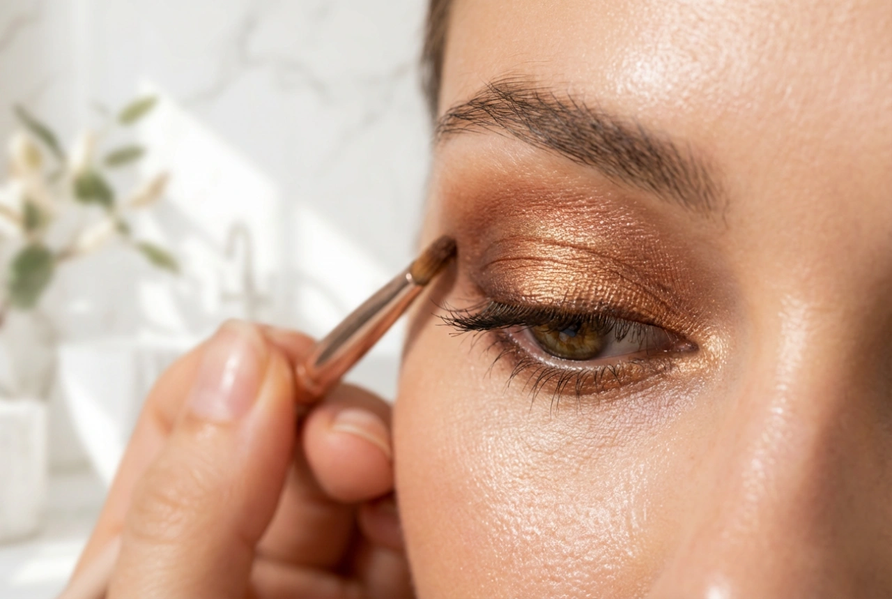
- Lid Shades: This is often the star of the show! Lid shades can come in any finish—matte, satin, shimmer, or metallic. They are packed onto the mobile part of the eyelid to provide the main pop of colour or texture.
- Crease & Definition Shades: These are deeper matte or satin shades used to add depth and dimension to the eye. Applied to the crease and outer corner of the eye, they create a contouring effect that can make the eyes appear larger or change their shape.
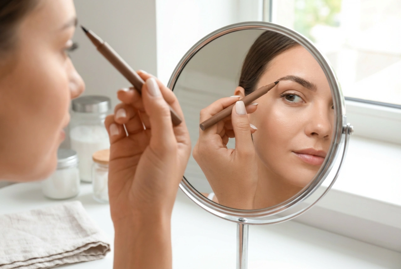
- Liner or Outer 'V' Shades: The darkest colours in the palette, often deep browns, charcoals, or blacks. They are used with precision at the lash line to define the eyes like an eyeliner or concentrated in the outer corner (the 'V' shape) to add intensity and a smoky effect.
- Highlight Shades: These are the lightest, most reflective shades in the palette. Typically in shimmer or satin finishes, they are used to attract light to certain areas. A dab on the inner corner of the eye makes you look more awake, while a touch under the arch of the eyebrow provides a subtle lift.
Creating Harmonious Colour Combinations
With an understanding of your palette's layout and the function of each shade, you can start creating combinations. Basic colour theory can guide you in pairing shades effectively.
Monochromatic Looks
This is the simplest approach and always looks chic. A monochromatic look involves using different tones and tints of a single colour. For example, you could use a light matte peach as a transition, a medium satin peach on the lid, and a deep matte terracotta in the crease. This creates a cohesive and polished look.
Analogous Colour Schemes
Analogous colours are those that sit next to each other on the colour wheel, such as yellow, orange, and red. Using these colours together creates a beautiful, blended effect that resembles a natural gradient, like a sunset. For instance, you could blend a soft yellow into a vibrant orange on the lid, deepening the crease with a soft red-brown.
Complementary Colour Schemes
Complementary colours are opposites on the colour wheel (e.g., blue and orange, purple and yellow). When placed next to each other, they create a strong contrast that makes both colours appear more vibrant. In makeup, this is a powerful technique for making your natural eye colour pop. To avoid an overwhelming look, use one colour as your main shade and its complement as a small accent, such as a thin line of coloured liner or a pop of shimmer on the centre of the lid.